Part 1 of 4

SYV Online
Preparing student futures
UI/UX Design Case Study
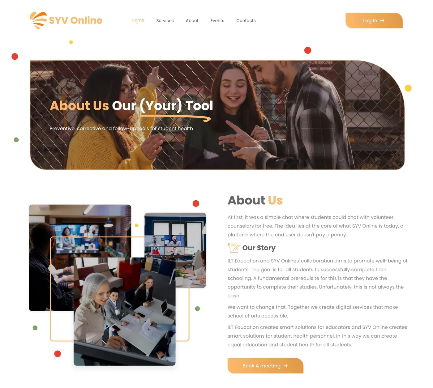
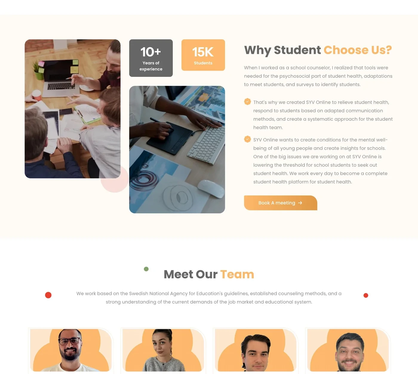
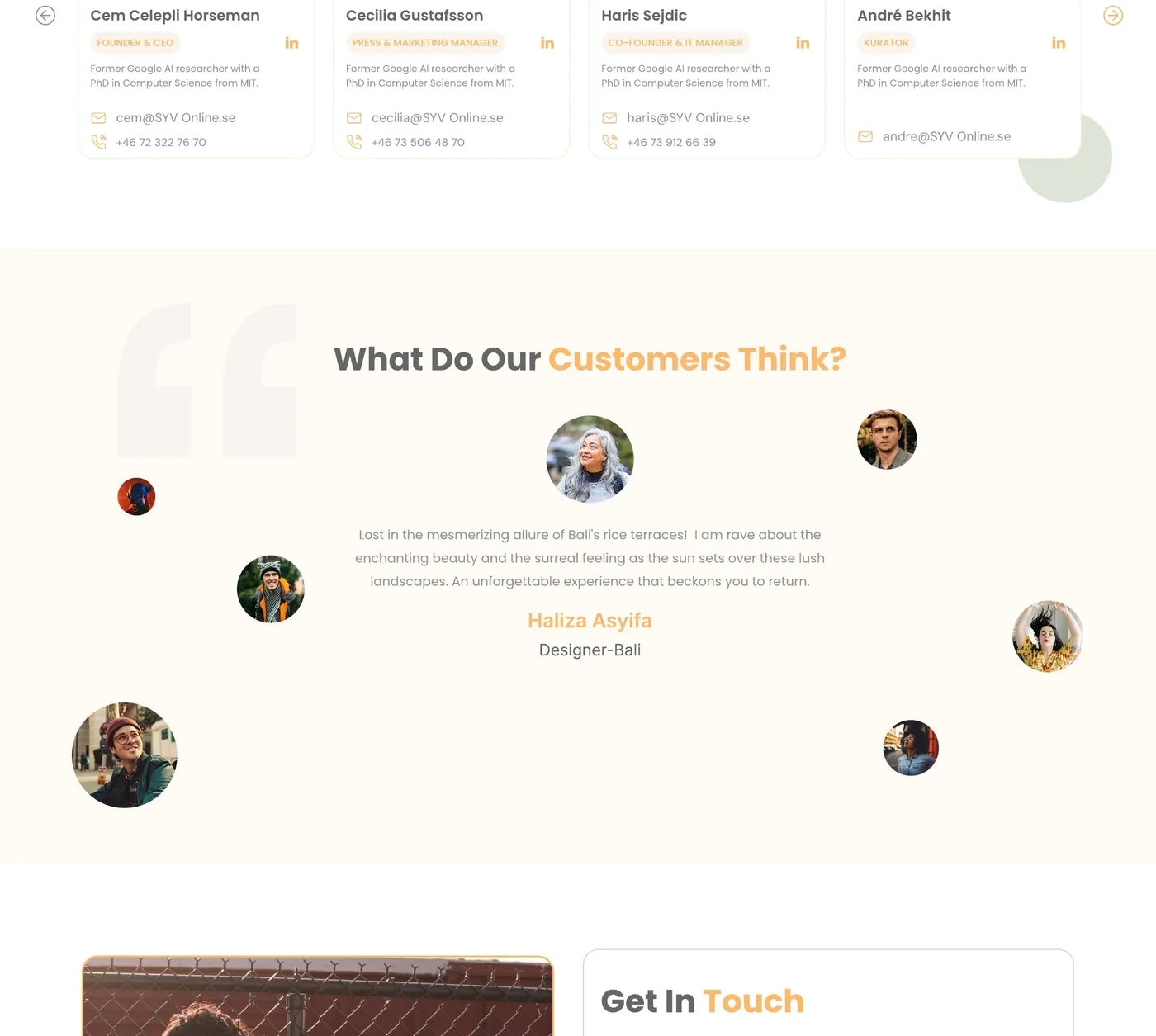
AlnairTech designed SYV Online’s marketing experience - overview, about, services, collaboration, and contact - with warm orange branding that feels friendly for students and credible for institutions.


01 — Overview
AlnairTech designed SYV Online’s marketing experience - overview, about, services, collaboration, and contact - with warm orange branding that feels friendly for students and credible for institutions.
02 — Challenge
SYV needed approachable visuals and plain-language hierarchy, while still giving institutions a clear collaboration path.
03 — Solution
We designed overview, services, collaboration, and contact compositions with friendly type, orange accents, and structured pathways that invite the next conversation.
04 — Design Showcase
Scroll the homepage, then explore services and partnership screens.

05 — Spotlight
Services and collaboration moments designed to feel human.
Services
SYV Online
Services layouts unpack responsibilities so institutions and partners see value and feel ready to talk.
Each capability has a human entry story.
Student and partner needs stay distinct.
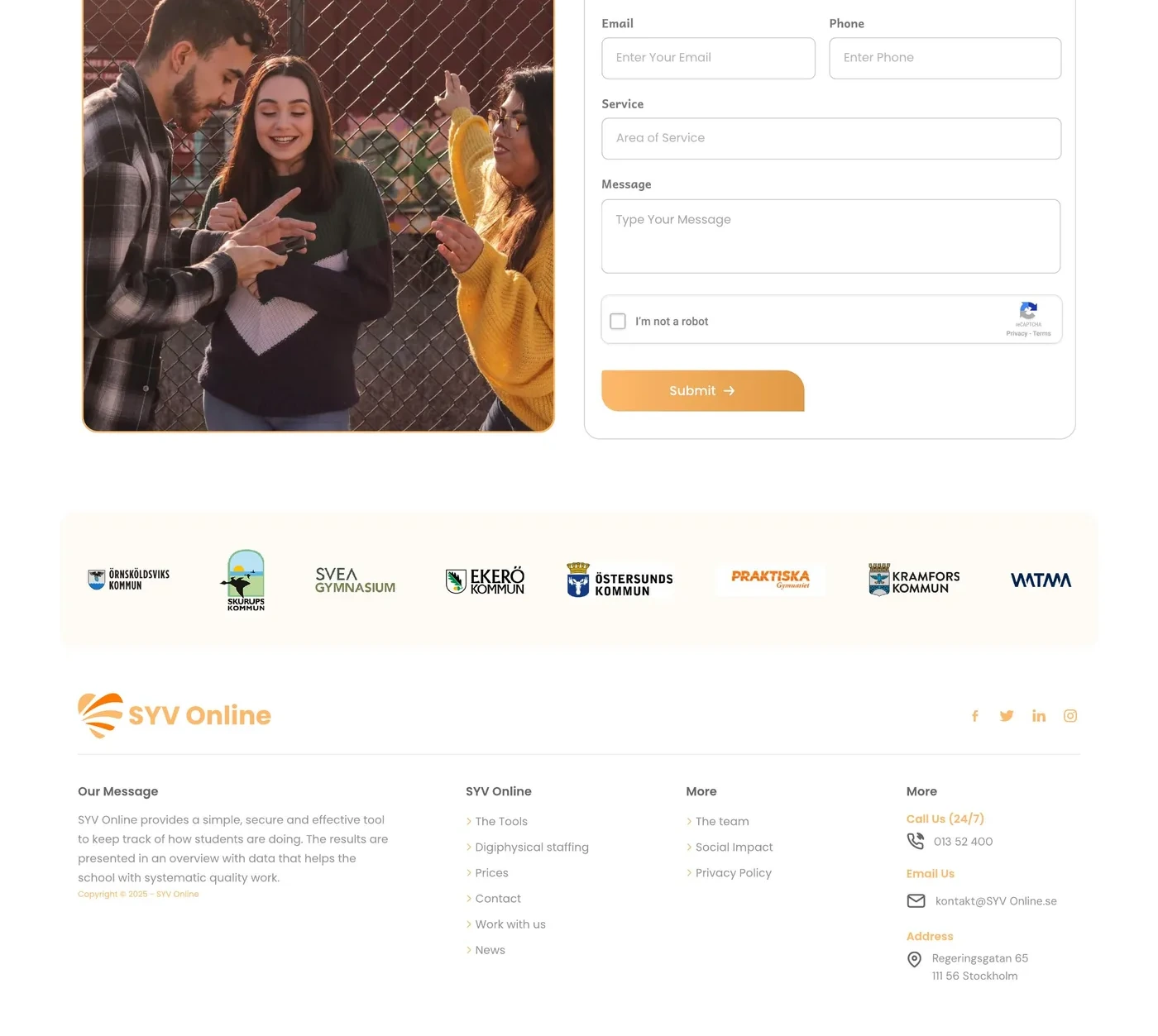
Contact sits close to the value story.

Partnership flow
Collaboration and partnership pathway.

Get in touch and meeting conversion.

07 — Testimonial
The design feels approachable for students and still serious enough for partners - exactly the balance we wanted.


